
Why a Command Palette Makes Your Dashboard Feel Like a Professional App
A command palette gives power users keyboard-first navigation across every feature in your app — and users who discover it stop using your sidebar within the first session. Platform totals from production: 10 tools, 6 networks, $20-60/month AI spend, 58,641 lines, 4-month solo build.
See also: tool registry that powers command palette search and dark mode with next-themes on the same platform.
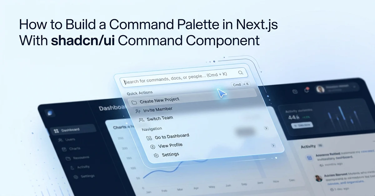
I built a Cmd+K palette in an affiliate marketing SaaS on Next.js 16 — a dashboard with 10 registered tools (7 AI-powered, 2 non-AI, 1 mini-app), navigation shortcuts, and fuzzy search across tool names, descriptions, and categories. Linear, Vercel, and Raycast all ship command palettes. Users expect them in professional SaaS products. The build took about two hours and under 100 lines of TypeScript for the core hook plus component. The UX payoff is immediate: power users type three characters and land on any tool without scrolling a sidebar.
What it enables: search tools by name or category, jump to Dashboard or Settings, navigate to any /tools/[slug] page on Enter — all without lifting hands off the keyboard. Three groups in the palette: Tools (from the registry), Navigation (hardcoded shortcuts), and optionally Actions (Server Action triggers like "Sync Sales"). AI-powered tools show an AI badge in the results list so users can distinguish Gemini-backed tools from static utilities at a glance.
If your dashboard has more than five features, a command palette pays for itself in the first week. Sidebar navigation scales poorly beyond a dozen links — users scroll, lose context, forget where things live. Cmd+K collapses the entire app into one searchable surface.
I evaluated kbar and a DIY filter before settling on shadcn/ui Command. kbar ships a similar API but adds another dependency layer on top of cmdk. shadcn/ui gives me styled components that match the rest of the dashboard — same border radius, muted backgrounds, focus rings — without writing custom CSS. The comparison table below summarizes setup effort across five approaches; for a Next.js App Router dashboard already using shadcn/ui, CommandDialog is the fastest path to production.
| Approach | Setup effort | Fuzzy search | Keyboard nav | ARIA | React-native |
|---|---|---|---|---|---|
| shadcn/ui Command (cmdk) | Low (~30 min) | ✅ Built-in | ✅ Built-in | ✅ Full | ✅ Yes |
| DIY input + filter | Medium (2–4 hrs) | ❌ Manual regex | ❌ Manual | ⚠️ Manual | ✅ Yes |
| kbar library | Low–Medium | ✅ Built-in | ✅ Built-in | ✅ Full | ✅ Yes |
| Downshift | Medium | ⚠️ Partial | ✅ Built-in | ✅ Full | ✅ Yes |
| Headless UI Combobox | Medium | ⚠️ Manual | ✅ Built-in | ✅ Full | ✅ Yes |
A command palette is the feature that reveals whether your app was designed for its users or for a portfolio screenshot. Power users learn Cmd+K in the first session and never touch the sidebar again. It's a 2-hour build that makes your dashboard feel 10× more mature.
The shadcn/ui Command Component: What Each Piece Does
In this command palette Next.js shadcn/ui tutorial 2026, shadcn/ui's Command component wraps cmdk (^1.1.1) — a headless command menu library — and provides pre-styled composable components that handle fuzzy search, keyboard navigation, and ARIA accessibility automatically.
The 7 components you'll use
- CommandDialog — wraps Command in a modal Dialog (the popup pattern)
- CommandInput — the text input; cmdk watches its value for filtering
- CommandList — the scrollable container for results
- CommandEmpty — renders when no items match the current query
- CommandGroup — a labeled section with a heading
- CommandItem — a selectable result (keyboard navigable, click or Enter)
- CommandSeparator — visual divider between groups
CommandShortcut displays keyboard hints on the right of items — optional but useful for navigation shortcuts. shadcn/ui handles ARIA automatically: role="combobox" on input, role="listbox" on list, role="option" on items, arrow keys for navigation, Enter to select, Escape to close. No additional ARIA work needed — cmdk ships with full keyboard accessibility out of the box.
Install with npx shadcn@latest add command. This pulls in cmdk ^1.1.1 and the shadcn/ui wrapper components. The Command component is a client component — it uses React state for filtering and focus management. Your dashboard layout can stay a Server Component; only CommandPalette and the trigger button need 'use client'.
CommandDialog is the pattern most SaaS dashboards want — a modal overlay that dims the page behind it, identical to Linear or Vercel. The alternative is an inline Command embedded in the navbar, which works for simple search but lacks the focused, keyboard-first feel. CommandDialog also inherits Dialog's focus trap: when the palette opens, Tab cycles through results instead of falling through to the page underneath.
The value prop — the most important thing to understand
The value prop on CommandItem is the string cmdk uses for fuzzy matching. It is NOT the displayed label. If you show "Ad Copy Generator" but set value="Ad Copy Generator", searching "facebook" won't find it — even if the tool's section is facebook.
Fix: concatenate all searchable fields:
value={`${tool.name} ${tool.description} ${tool.category} ${tool.section}`}
Typing "youtube" finds YouTube tools. Typing "finance" finds tools in the Finance category. Typing "ad copy" matches against the description field even when the displayed label is shorter. The displayed children are separate — just what the user sees. Fuzzy search operates on value. This is the most non-obvious part of the entire implementation — get it wrong and users complain that search "doesn't work" for half your tools.
The value prop on CommandItem must include every string you want the user to be able to search for. The displayed content (children) is separate — it's just what the user sees. The fuzzy search operates on value, not on what renders in the DOM.
The Global Cmd+K Listener: Opening the Palette From Anywhere
Mount a keydown event listener in a custom hook that toggles the palette open state on Cmd+K (Mac) or Ctrl+K (Windows/Linux), and clean it up on unmount to prevent memory leaks.
// src/hooks/useCommandPalette.ts

'use client'

import { useState, useEffect, useCallback } from 'react'

export function useCommandPalette() {
  const [open, setOpen] = useState(false)

  useEffect(() => {
    const down = (e: KeyboardEvent) => {
      if (e.key === 'k' && (e.metaKey || e.ctrlKey)) {
        e.preventDefault()   // stops browser native Cmd+K (focus address bar)
        setOpen(prev => !prev)
      }
    }

    document.addEventListener('keydown', down)
    return () => document.removeEventListener('keydown', down)
  }, [])

  const toggle = useCallback(() => setOpen(prev => !prev), [])
  const close = useCallback(() => setOpen(false), [])

  return { open, toggle, close }
}
e.metaKey vs e.ctrlKey — cross-platform
e.metaKey fires on Cmd (Mac). e.ctrlKey fires on Ctrl (Windows/Linux). Check both so the shortcut works everywhere. Never use e.keyCode — it's deprecated and unreliable for modifier keys.
Why e.preventDefault() is essential
Without it: Cmd+K on Chrome or Safari focuses the browser's address bar. The command palette opens AND the URL bar activates — disorienting. Always call e.preventDefault() when handling keyboard shortcuts that overlap browser defaults. The same applies to Ctrl+K on Windows — some browsers bind it to search or bookmark actions.
The hook returns { open, toggle, close }. CommandPalette reads open and close to control CommandDialog. The navbar trigger reads toggle. Extracting this into a hook keeps the keyboard listener in one place — not duplicated across components with slightly different cleanup logic.
One keyboard shortcut serves the entire dashboard: Cmd+K on Mac, Ctrl+K on Windows and Linux. I register the listener on document, not on a specific input, so the palette opens whether the user is focused on a form field, a chart, or empty page space. That global scope is why layout-level mounting matters — the listener must survive route changes without re-attaching on every navigation.
shadcn/ui's CommandDialog handles Escape automatically — it's a Dialog underneath. If you build the palette as an inline Command (not Dialog), add Escape handling manually. Always remove the keydown listener in the useEffect cleanup to prevent memory leaks on navigation.
Using Your Tool Registry as the Command Palette Data Source
Any array of typed objects — tool configs, nav items, recent pages — can feed directly into the Command component; the registry pattern means adding a new tool automatically makes it searchable in the palette.
Tools live in src/features/tools/config/tools.ts as a ToolConfig[] array. Each entry has id, name, slug, description, section (facebook, instagram, youtube, etc.), category (Finance, Analytics, Content), status, and hasAI. The sidebar and command palette both read from this single source — add a tool once, it appears in both places. Navigation uses router.push() from next/navigation on item select, then closes the dialog.
// src/components/command-palette.tsx

'use client'

import { useRouter } from 'next/navigation'
import {
  CommandDialog, CommandInput, CommandList, CommandEmpty,
  CommandGroup, CommandItem, CommandSeparator,
} from '@/components/ui/command'
import { useCommandPalette } from '@/hooks/useCommandPalette'
import { tools } from '@/features/tools/config/tools'
import { LayoutDashboard, Settings, HelpCircle } from 'lucide-react'

const NAV_ITEMS = [
  { label: 'Dashboard', href: '/dashboard', Icon: LayoutDashboard },
  { label: 'Network Settings', href: '/settings/networks', Icon: Settings },
  { label: 'Help', href: '/help', Icon: HelpCircle },
] as const

export function CommandPalette() {
  const router = useRouter()
  const { open, close } = useCommandPalette()

  const handleSelect = (href: string) => {
    router.push(href)
    close()
  }

  const activeTools = tools.filter(t => t.status === 'active')

  return (
    <CommandDialog open={open} onOpenChange={close}>
      <CommandInput placeholder="Search tools, navigate..." />
      <CommandList>
        <CommandEmpty>No results found.</CommandEmpty>

        <CommandGroup heading="Tools">
          {activeTools.map(tool => (
            <CommandItem
              key={tool.id}
              value={`${tool.name} ${tool.description} ${tool.category} ${tool.section}`}
              onSelect={() => handleSelect(`/tools/${tool.slug}`)}
            >
              <span className="mr-2 text-base">{tool.icon}</span>
              <span>{tool.name}</span>
              {tool.hasAI && (
                <span className="ml-auto text-[10px] text-muted-foreground bg-muted px-1.5 py-0.5 rounded font-medium">
                  AI
                </span>
              )}
            </CommandItem>
          ))}
        </CommandGroup>

        <CommandSeparator />

        <CommandGroup heading="Navigation">
          {NAV_ITEMS.map(({ label, href, Icon }) => (
            <CommandItem
              key={href}
              value={label}
              onSelect={() => handleSelect(href)}
            >
              <Icon className="mr-2 h-4 w-4" />
              {label}
            </CommandItem>
          ))}
        </CommandGroup>
      </CommandList>
    </CommandDialog>
  )
}
The self-updating registry benefit
Adding a new tool to the registry array automatically makes it searchable. No manual update to the command palette. The registry is the single source of truth for sidebar nav and Cmd+K search — one array, two consumers.
Filtering by status
tools.filter(t => t.status === 'active') keeps coming-soon and deprecated tools out of search results. Coming-soon tools in the palette frustrate users who click them and hit a placeholder page. Beta tools can appear if you want early access discoverability — I include them with a status badge in the sidebar but exclude them from the palette until promoted to active.
The hasAI boolean drives a small badge in the CommandItem row — seven of my ten tools show "AI" on the right. Users searching for AI capabilities can type "AI" in the query, but the badge gives instant visual confirmation without reading descriptions. Lucide icons render from the tool's icon field name; the registry stores the string, and a small icon map resolves it to the React component at render time.
Navigation items in Group 2 are hardcoded — Dashboard, Network Settings, Help — because they are app routes, not tools. Their value is just the label since there is no metadata to concatenate. Group 3 (Actions) is optional in V1; I left it out until the navigation layer was stable, then added "Sync Sales" in V2 as a Server Action trigger.
The Trigger Button: Teaching Users the Shortcut Before They Know It
Add a visible "Search..." button in your navbar with a keyboard shortcut hint — most users won't discover Cmd+K on their own, but they'll click the button and start using the shortcut after the first time.
// ── Part 1: Trigger button in navbar ──

'use client'

import { Search } from 'lucide-react'
import { Button } from '@/components/ui/button'
import { useCommandPalette } from '@/hooks/useCommandPalette'

export function CommandPaletteTrigger() {
  const { toggle } = useCommandPalette()

  return (
    <Button
      variant="outline"
      onClick={toggle}
      className="gap-2 text-muted-foreground text-sm w-full max-w-xs"
    >
      <Search className="h-4 w-4" />
      Search tools...
      <kbd className="ml-auto pointer-events-none inline-flex h-5 select-none
        items-center gap-1 rounded border bg-muted px-1.5 font-mono
        text-[10px] font-medium opacity-100">
        <span className="text-xs">⌘</span>K
      </kbd>
    </Button>
  )
}

// ── Part 2: Mount once in dashboard layout ──

// app/(dashboard)/layout.tsx
import { CommandPalette } from '@/components/command-palette'

export default function DashboardLayout({
  children,
}: { children: React.ReactNode }) {
  return (
    <div className="flex h-screen">
      <CommandPalette />   {/* persists across page navigation */}
      <aside className="sidebar">...</aside>
      <main className="flex-1">{children}</main>
    </div>
  )
}
Why mount at the layout level, not the page level
If CommandPalette mounts on each page individually, the component unmounts on navigation — state resets, open state lost, Cmd+K fires during navigation delay and nothing opens. Mounting at the layout level means the same instance handles every page's keyboard events for the entire session. One mount in app/(dashboard)/layout.tsx, not in individual tool pages. Place the trigger button in the sidebar or top navbar — both call the same toggle function once you lift state to a Context Provider.
The kbd element in the trigger button teaches users the shortcut exists. Most users click "Search tools..." first, see the palette open, notice the ⌘K hint, and start using the keyboard shortcut from the second session onward. Without the visible trigger, Cmd+K discovery rate is near zero for non-technical users.
I place the trigger in the sidebar header on desktop and collapse it to an icon on mobile — same toggle function, same shared state. The button uses variant="outline" and muted text so it reads as a search field affordance, not a primary action. That visual hierarchy matches how Vercel and Linear present their command palette triggers: subtle, always visible, never competing with CTAs.
The useCommandPalette hook is called in both CommandPalette and CommandPaletteTrigger. For state to be shared between them — opening from both the button AND the keyboard shortcut — lift the hook to a Context Provider or use a Zustand store. For most SaaS dashboards, a context provider wrapping the dashboard layout is sufficient.
What to Build in V2: Recent Items, Actions, and Cross-App Search
The V1 command palette handles navigation — V2 makes it a power user hub by adding recently-used items at the top, global actions that trigger Server Actions directly, and deep search across the user's own data.
Recent items group
Store last-visited tool slugs in localStorage (or a session store). On open with no query: show a "Recent" group first — max 3–5 items. This surfaces the most-used tools immediately without typing. Users who run the same three tools daily stop searching entirely after the first week.
The implementation is straightforward: on every successful handleSelect, push the slug to a recentTools array in localStorage (dedupe, cap at five). When CommandDialog opens with an empty input, render the Recent group above Tools. Hide it once the user starts typing — cmdk filtering takes over. No backend required; the data is per-browser and good enough for daily workflow shortcuts.
Global actions
Add CommandItems that call Server Actions directly:
<CommandItem onSelect={() => { syncSalesAction(); close() }}>
  Sync Sales Data
</CommandItem>
This turns the command palette into a keyboard-first action hub — not just navigation. The affiliate SaaS hourly sales sync is a natural candidate: power users trigger it from Cmd+K instead of navigating to Settings.
What to avoid
Don't add every possible action — a cluttered palette is worse than no palette. Keep the Actions group to 3–5 critical operations maximum. Don't search user's sales data or link analytics in V1 — that requires async fetching and debounced queries. Save cross-app search for V2 when the navigation layer is proven.
The V1 palette I shipped handles everything a daily user needs: find a tool, navigate to settings, open help. V2 adds recent items from localStorage and a "Sync Sales" action that calls a Server Action — turning Cmd+K from a navigation shortcut into a command center. Hassan Raza documents the full Next.js affiliate SaaS stack — multi-tenant Prisma schema, Server Actions, command palettes — across posts on hassanr.com, including the multi-tenant data isolation pattern that keeps each user's tool data scoped correctly.
Frequently Asked Questions
Install shadcn/ui Command, create a useCommandPalette hook, and mount in your layout. Run npx shadcn@latest add command to add the component. Build a useCommandPalette hook with useState and a useEffect keydown listener for Cmd+K and Ctrl+K. Wrap results in CommandDialog with CommandGroup and CommandItem components. Mount CommandPalette once in your dashboard layout — not per page — so it persists across navigation. The complete setup takes 30–60 minutes for a working palette with search and navigation. Any typed array — tool registry, nav items, recent pages — can feed directly into CommandItem components.
shadcn/ui Command wraps cmdk — a headless command menu with built-in fuzzy search. Key components: CommandDialog (modal wrapper), CommandInput (cmdk watches this for filtering), CommandList (scrollable results), CommandGroup (labeled section), CommandItem (selectable result), CommandEmpty (no results state). Fuzzy search operates on the value prop of each CommandItem — not the displayed children. Include all searchable text in value — name, description, category — so items are discoverable by any metadata, not just the label.
Add a useEffect keydown listener that toggles palette state on Cmd+K or Ctrl+K. Check e.key === 'k' && (e.metaKey || e.ctrlKey) for cross-platform support. Call e.preventDefault() to stop the browser's native Cmd+K behavior. Toggle a boolean state controlling CommandDialog's open prop. Add a visible trigger button in the navbar with a kbd element showing ⌘K — most users won't discover the shortcut alone. Mount CommandPalette at the layout level so it handles keyboard events on every page.