
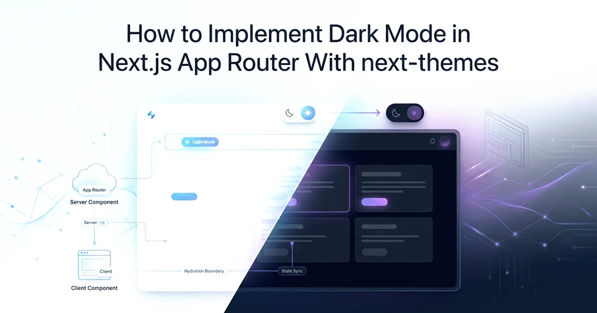
The Three Dark Mode Gotchas in Next.js App Router (And How to Fix All of Them)
Dark mode with next-themes in App Router requires three specific fixes — suppressHydrationWarning on html, a separate Providers client component, and a mounted check in the theme toggle — without all three, you get flashes, hydration warnings, and undefined theme values. Platform totals from production: 10 tools, 6 networks, $20-60/month AI spend, 58,641 lines, 4-month solo build.
See also: Cmd+K command palette on the same SaaS and multi-tenant Next.js SaaS architecture.
I added dark and light theme support to an affiliate marketing SaaS dashboard on Next.js 16 using next-themes ^0.4.6, Tailwind CSS 4, and HSL-based CSS design tokens in globals.css with WCAG contrast ratios documented next to each critical color pair. The first build looked correct in development. Production users on dark mode saw a white flash on every page load. The console showed hydration warnings. The theme toggle icon flipped from moon to sun a frame after paint. Three separate bugs, three separate fixes.
What each gotcha looks like
Gotcha 1 — hydration flash: The server renders the page in light mode because it cannot read localStorage. The HTML arrives white. next-themes reads the stored preference on the client and adds class="dark" to html — the page snaps from light to dark. Users with dark mode preference see a visible flash on every navigation. Fix: suppressHydrationWarning on html plus the Providers pattern (covered in the next section).
Gotcha 2 — ThemeProvider in a Server Component: Drop ThemeProvider directly into layout.tsx and Next.js throws an error — ThemeProvider uses React context internally, and context does not work in Server Components. Adding 'use client' to layout.tsx forces the entire layout client-side, losing RSC optimisations for every child. Fix: isolate ThemeProvider in a separate Providers client component.
Gotcha 3 — undefined theme in the toggle: useTheme() returns theme: undefined before mount because localStorage does not exist on the server. Render a moon icon based on undefined on the client but the server rendered a sun icon — React reports a hydration mismatch. The icon visibly flips after the first paint. Fix: mounted check with a same-size placeholder until useEffect runs.
The rest of this post walks through each fix in order — Providers setup, class vs attribute strategy, CSS variables, the theme toggle, and two advanced patterns I use in the dashboard sidebar. Each section follows the same structure: symptom first, cause second, fix third. If you have already hit one of these bugs, jump to the relevant section from the table of contents.
The Providers Pattern: ThemeProvider in App Router Without Breaking SSR
Wrap ThemeProvider in a separate 'use client' Providers component and import it in layout.tsx — this keeps layout.tsx as a Server Component while giving ThemeProvider the client context it needs.
This dark mode Next.js App Router next-themes implementation 2026 starts here. Every other piece — CSS variables, the toggle, forced dark sections — assumes ThemeProvider is mounted correctly at the root. Get this wrong and nothing downstream works reliably.
Why layout.tsx can't directly use ThemeProvider
layout.tsx is a Server Component by default in the App Router. ThemeProvider from next-themes wraps children in a React context provider — context requires client-side JavaScript. If you add 'use client' to layout.tsx, the entire layout tree becomes a client bundle. Metadata exports, server-side data fetching in nested layouts, and RSC streaming optimisations all degrade. The Providers pattern creates a minimal client boundary: only the ThemeProvider wrapper runs on the client; everything else stays a Server Component.
// ── Part 1: src/app/providers.tsx — client island for ThemeProvider ──

'use client'

import { ThemeProvider } from 'next-themes'
import type { ReactNode } from 'react'

export function Providers({ children }: { children: ReactNode }) {
  return (
    <ThemeProvider
      attribute="class"              // class strategy: adds .dark to <html>
      defaultTheme="system"            // respects OS dark mode on first visit
      enableSystem                     // live updates when OS preference changes
      disableTransitionOnChange        // no color sweep on theme switch
    >
      {children}
    </ThemeProvider>
  )
}

// ── Part 2: src/app/layout.tsx — stays a Server Component ──

import type { Metadata } from 'next'
import type { ReactNode } from 'react'
import { Providers } from './providers'
import './globals.css'

export const metadata: Metadata = { title: 'Dashboard' }

export default function RootLayout({ children }: { children: ReactNode }) {
  return (
    <html lang="en" suppressHydrationWarning>
      {/* suppressHydrationWarning: next-themes changes class on html after
          hydration — React would warn without this flag */}
      <body>
        <Providers>{children}</Providers>
      </body>
    </html>
  )
}
What suppressHydrationWarning actually does
It does NOT suppress all hydration warnings — only the one on the element it is applied to. It tells React: the class attribute on html will differ between server render and client hydration, and that difference is intentional. The server cannot know the user's stored theme preference. The client applies it from localStorage immediately after hydration. Without this flag, React logs a warning on every page load for every user with a non-default theme. Apply it to <html> only — not to every element that might mismatch.
The four ThemeProvider props each solve a specific problem. attribute="class" tells next-themes to toggle a CSS class rather than a data attribute — required for Tailwind v4. defaultTheme="system" respects the OS preference on first visit before the user picks manually. enableSystem keeps the page in sync when the user changes their OS setting mid-session. disableTransitionOnChange prevents the visible color sweep I describe in the advanced patterns section.
suppressHydrationWarning isn't a hack — it's the correct signal. The server renders without knowing the user's theme preference. The client applies the preference from localStorage. The mismatch is by design. suppressHydrationWarning tells React that this specific difference is expected, not an error. Apply it to <html> only — not to every element with a mismatch.
Class Strategy vs Attribute Strategy: Which One to Use With Tailwind
Use the class strategy (attribute="class") with Tailwind CSS — it adds .dark to the html element, which is exactly what Tailwind v4's dark: variants look for by default.
The affiliate marketing SaaS I built uses class strategy with Tailwind 4 — no tailwind.config.js, no darkMode key. next-themes adds class="dark" to html when dark mode is active. Every dark: utility in the dashboard responds automatically.
| Class strategy (attribute="class") | Attribute strategy (attribute="data-theme") | |
|---|---|---|
| HTML change | Adds class="dark" to html | Adds data-theme="dark" to html |
| Tailwind v4 | ✅ Works out of the box | ⚠️ Requires custom CSS variant |
| Tailwind v3 | ✅ Needs darkMode: 'class' in config | ⚠️ Needs custom config |
| CSS selector | .dark { ... } |
[data-theme="dark"] { ... } |
| Multi-theme support | ❌ Only dark/light | ✅ Any theme name |
| shadcn/ui compatibility | ✅ Default | ⚠️ Requires custom setup |
| When to use | Tailwind projects (most SaaS) | Non-Tailwind or multi-theme |
Tailwind v4 and dark mode
In Tailwind v4, no tailwind.config.js is needed for dark mode. The dark: utility prefix works automatically when a .dark class appears on an ancestor element. This is a change from Tailwind v3, where you needed darkMode: 'class' in config. With attribute="class" in ThemeProvider, next-themes adds .dark to html, and every dark:bg-muted or dark:text-foreground utility in your dashboard responds without additional setup.
When to use attribute strategy instead
Non-Tailwind projects using CSS Modules or vanilla CSS often prefer attribute selectors: [data-theme="dark"] { --background: #1a1a1a; }. Multi-theme products — not just dark/light but "ocean", "sunset", custom brand themes — need the attribute strategy because the class approach only supports two states. Set attribute="data-theme" in ThemeProvider and define one CSS block per theme name.
If you're migrating from Tailwind v3 (which needed darkMode: 'class' in config) to Tailwind v4, remove the darkMode config entirely — v4 handles it automatically. Leaving the old config causes no errors but is dead code.
CSS Variables: Defining Light and Dark Values in globals.css
Every CSS variable that changes between modes needs a value in :root (light mode) and a value in .dark — using HSL with separated values allows Tailwind's opacity modifiers to work correctly.
Defining variables once in :root is not enough. I learned this the hard way: a card background stayed white in dark mode because I forgot to override --card in .dark. No console error — just a design bug that looked broken on every dark-mode screenshot.
The HSL approach — separating value from function
Store HSL components without the hsl() wrapper: --background: 0 0% 100%; not --background: hsl(0, 0%, 100%);. Usage in CSS: background-color: hsl(var(--background));. In Tailwind: bg-background resolves to hsl(var(--background)). Opacity modifiers work: bg-background/50 becomes hsl(var(--background) / 0.5). If you stored the full hsl() value, the slash opacity syntax breaks.
/* src/app/globals.css — Tailwind v4 + HSL design tokens */

@import "tailwindcss";

/* Light mode tokens — H S% L% only, no hsl() wrapper */
:root {
  --background: 0 0% 100%;
  --foreground: 240 10% 3.9%;
  --primary: 240 5.9% 10%;
  --card: 0 0% 100%;
  --border: 240 5.9% 90%;
  --muted: 240 4.8% 95.9%;
  --muted-foreground: 240 3.7% 46.1%;
  --ring: 240 10% 3.9%;
  /* --foreground on --background: 15.8:1 (AAA) */
  /* --muted-foreground on --background: 5.5:1 (AA) */
}

/* Dark mode overrides — every color token that changes */
.dark {
  --background: 240 10% 3.9%;
  --foreground: 0 0% 98%;
  --primary: 0 0% 98%;
  --card: 240 10% 3.9%;
  --border: 240 3.7% 15.9%;
  --muted: 240 3.7% 15.9%;
  --muted-foreground: 240 5% 64.9%;
  --ring: 240 4.9% 83.9%;
  /* --foreground on --background: 15.8:1 (AAA) */
  /* --primary on --background: 14.2:1 (AAA) */
}

@layer base {
  * {
    @apply border-border;
  }
  body {
    @apply bg-background text-foreground;
    font-feature-settings: "rlig" 1, "calt" 1;
  }
}
What needs two definitions
Define in both :root and .dark: background, foreground, card, border, muted, primary, ring — anything that changes color between modes. Do not duplicate: radius, font sizes, spacing, layout variables. Only visual/color tokens need dark overrides. I document WCAG contrast ratios as comments next to critical pairs — 15.8:1 for foreground on background (AAA), 5.5:1 for muted-foreground on background (AA). Plug HSL values into a contrast checker before shipping; both modes must pass.
The @layer base section connects variables to Tailwind utilities. @apply bg-background text-foreground on body means every page inherits the correct colors without adding classes to each layout. When next-themes toggles .dark on html, every hsl(var(...)) reference updates simultaneously — no JavaScript required per component. This is why the CSS variable approach scales better than hardcoded Tailwind color classes for theme switching.
Forgetting to define a variable in .dark means it inherits the :root value — the element stays light in dark mode. No error, just a design bug. Check every variable in :root against .dark to make sure nothing is missing.
The Theme Toggle: The mounted Check You Cannot Skip
useTheme() returns theme: undefined during server render and before hydration — rendering the toggle icon based on undefined causes a hydration mismatch; the fix is to return a placeholder until the component mounts.
The toggle sits in the dashboard navbar next to the command palette trigger. It is the most visible piece of the dark mode implementation — and the most common source of hydration bugs if you skip the mounted check.
Why theme is undefined before mount
next-themes reads the stored theme from localStorage. localStorage does not exist on the server. On initial render — both server-side and the first client paint — useTheme().theme equals undefined. If you render <Sun /> when theme is dark but the server rendered <Moon /> because theme was undefined, React sees a mismatch and re-renders. Users see the icon flip. The mounted check prevents this entirely.
// src/components/theme-toggle.tsx

'use client'

import { useTheme } from 'next-themes'
import { Sun, Moon } from 'lucide-react'
import { useEffect, useState } from 'react'

export function ThemeToggle() {
  const { resolvedTheme, setTheme } = useTheme()
  const [mounted, setMounted] = useState(false)

  useEffect(() => { setMounted(true) }, [])

  // Placeholder with same dimensions — prevents layout shift
  if (!mounted) {
    return <div className="h-9 w-9 rounded-md" aria-hidden="true" />
  }

  // resolvedTheme resolves "system" → "dark" | "light" (never undefined after mount)
  const isDark = resolvedTheme === 'dark'

  return (
    <button
      onClick={() => setTheme(isDark ? 'light' : 'dark')}
      className="h-9 w-9 rounded-md border border-input flex items-center
                 justify-center hover:bg-accent hover:text-accent-foreground
                 transition-colors"
      aria-label={isDark ? 'Switch to light mode' : 'Switch to dark mode'}
      title={isDark ? 'Light mode' : 'Dark mode'}
    >
      {isDark
        ? <Sun className="h-4 w-4" />
        : <Moon className="h-4 w-4" />
      }
    </button>
  )
}
resolvedTheme vs theme
theme is the stored preference: "system", "dark", or "light". resolvedTheme is the actual applied theme: "dark" or "light" — it resolves "system" using prefers-color-scheme. Always use resolvedTheme for rendering icons and conditional styles. After mount, it is never undefined and always reflects what the user actually sees on screen. Using theme === 'dark' fails when the user chose system preference and their OS is in dark mode — theme stays "system" while the page renders dark.
Place the ThemeToggle in the dashboard navbar or settings dropdown — anywhere the user expects appearance controls. I pair it with the command palette trigger in the top bar. Both are client components in an otherwise server-rendered layout. The placeholder div during the mounted check uses the same h-9 w-9 dimensions as the final button so the navbar does not shift when the icon appears.
Advanced Patterns: Forced Dark Sections and System Theme Subscription
Force dark mode on specific elements by adding the .dark class directly to them — their children see a .dark ancestor and apply dark: variants regardless of the global theme.
The sidebar-stays-dark pattern
The dashboard sidebar in the platform stays visually dark in both light and dark global themes — a common pattern for admin panels and tool sidebars. Add className="dark" directly to the sidebar element:
<aside className="dark bg-background text-foreground border-r border-border h-screen">
  {/* Sidebar is always dark — independent of global theme toggle */}
  <nav>...</nav>
</aside>
Tailwind's dark: variants check the nearest .dark ancestor. The sidebar has .dark, so dark utilities inside it always apply — even when html is in light mode. The main content area follows the global theme; the sidebar stays consistently dark for usability.
The disableTransitionOnChange prop explained
Without disableTransitionOnChange, switching themes triggers every CSS transition on the page. If your globals.css or component styles include transition: background-color 200ms, the screen visibly sweeps from light to dark — dramatic and disorienting. next-themes temporarily injects * { transition: none !important } during the class change, then removes it after one frame. The result: instantaneous theme switch. I enable this on every production dashboard — users expect a snap, not an animation.
Accessing theme in Server Components
useTheme() is client-only. Server Components cannot call it. If you need the theme server-side — for example, rendering different OG images — read it from cookies (next-themes can persist theme to cookies after first client visit) or handle it in middleware. For most SaaS dashboards, server-side theme access is unnecessary: CSS variables handle the visual switch, and no server logic depends on light vs dark. Hassan Raza documents the full Next.js SaaS foundation — dark mode, command palettes, multi-tenant Prisma schemas — across posts on hassanr.com.
Frequently Asked Questions
Install next-themes and wrap ThemeProvider in a Providers client component. Run npm install next-themes, then create src/app/providers.tsx with ThemeProvider using attribute="class", defaultTheme="system", enableSystem, and disableTransitionOnChange. Import Providers in layout.tsx and add suppressHydrationWarning to the html element. Define CSS variables in :root and .dark in globals.css using HSL format (H S% L% without the hsl() wrapper). Add a ThemeToggle component with a mounted check — useState plus useEffect before rendering icons. The full setup takes about 30–45 minutes.
Add suppressHydrationWarning to html and a mounted check in ThemeToggle. First, add suppressHydrationWarning to the html element in layout.tsx — next-themes modifies the class attribute after hydration, which React would warn about without this. Second, in ThemeToggle, use a mounted check: useEffect sets mounted to true, and render a placeholder before mounted. useTheme() returns theme: undefined before mount; rendering an icon based on undefined causes a hydration mismatch. Use resolvedTheme (not theme) after mount — it resolves "system" to "dark" or "light" and reflects what the user actually sees.
The class strategy adds class="dark" to html when dark mode is active. Set attribute="class" in ThemeProvider — next-themes adds class="dark" to the html element. Tailwind v4 uses this class by default: dark: utility variants apply when .dark appears on an ancestor. The alternative, attribute strategy (attribute="data-theme"), adds data-theme="dark" instead. Use class strategy for Tailwind CSS projects — it is the default and easiest path. Use attribute strategy for non-Tailwind projects or multi-theme products where the theme name can be any string (ocean, sunset, etc.). shadcn/ui components are designed for the class strategy.